A CBD and THC infused concentrated tea pod.
Overview
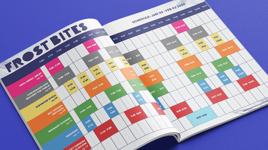
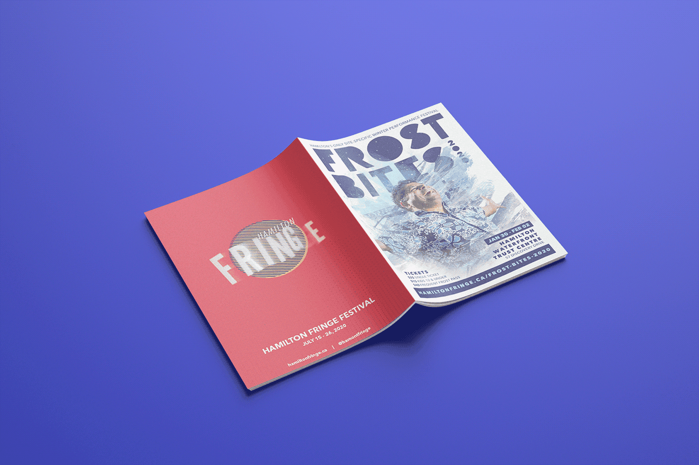
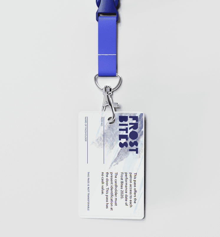
Frost Bites 2021 has switch their
Challenge
Though cannabis-infused products are still relatively new, major brands have already occupied the market. Additionally, many consumers still have reservations about cannabis. Attracting new customers will require an appealing branding and an innovative strategy.
Approach
Through a brief study of individuals under the age of 35, we discovered that many of them viewed tea as a traditional drink that didn't quite align with their fast-paced lifestyles. There is a large untapped market of millennial who lead busy and stressful lives and are searching for natural ways to overcome with life's challenges. This is why we created ZEN TEA – a CBD-infused beverage designed to help consumers find a sense of calm and focus amidst the chaos of modern life.
⭐️
Connect to Content
Add layers or components to make infinite auto-playing slideshows.
Identity
Our logo design is a fusion of two of our identities. At the top, a leaf captures the essence of our organic tea and cannabis, while below it, the diamond shape symbolizes our tea pods. Together, they form a unique and memorable visual representation of our brand.
Identity
Our logo design is a fusion of two of our identities. At the top, a leaf captures the essence of our organic tea and cannabis, while below it, the diamond shape symbolizes our tea pods. Together, they form a unique and memorable visual representation of our brand.
Identity
Our logo design is a fusion of two of our identities. At the top, a leaf captures the essence of our organic tea and cannabis, while below it, the diamond shape symbolizes our tea pods. Together, they form a unique and memorable visual representation of our brand.
Developing an integrated marketing campaign for a new cannabis product. This product, which can be either a consumable or a non-consumable, aims to stand out in the growing cannabis market.